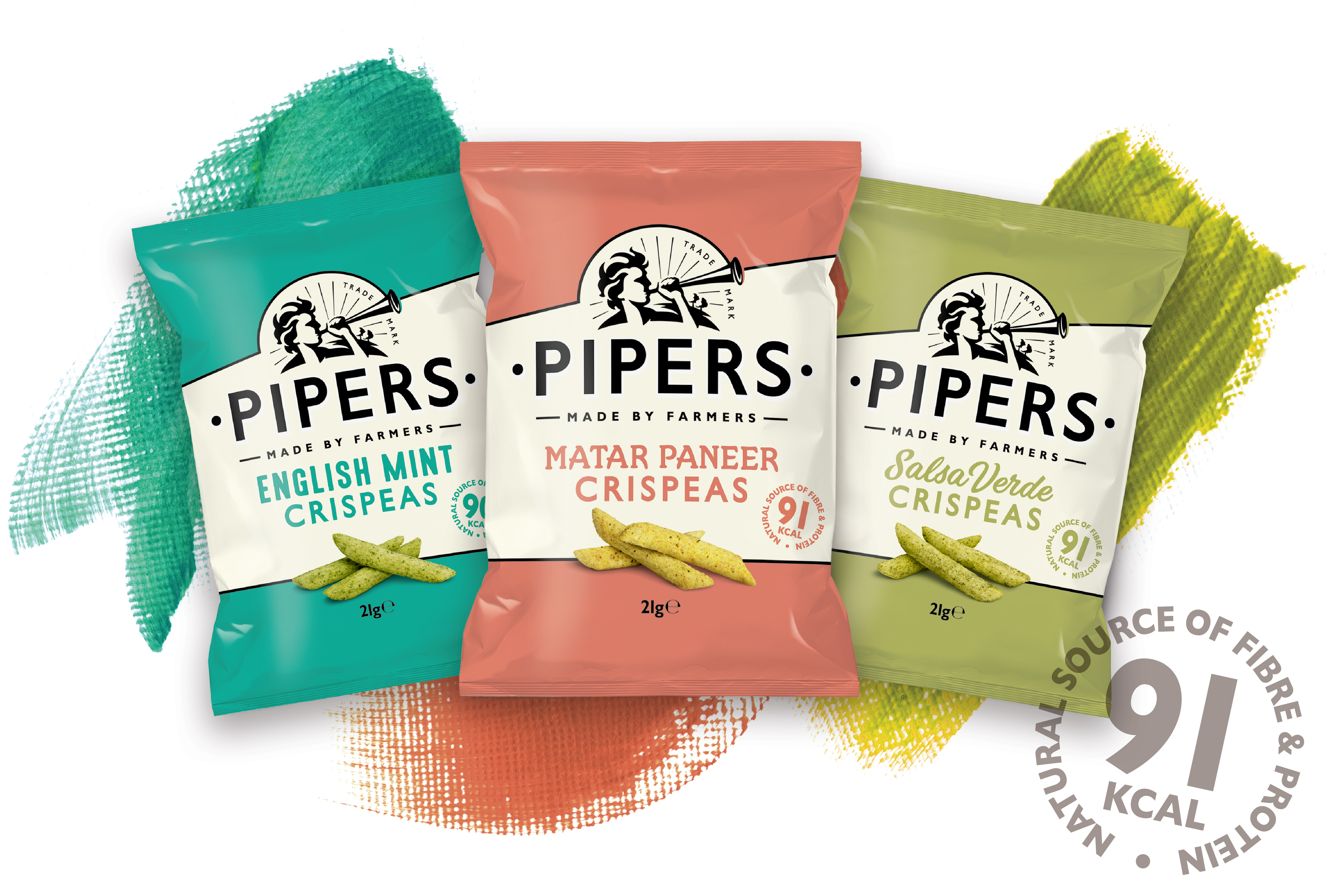
Pipers announce a new design for their brand packaging which will be introduced within the month of May 2018.
In a move aimed at keeping themselves ahead of their competitors, Pipers Crisps has announced a significant packaging refresh. The new design development gives more emphasis and personality to the ‘Piper’ man, who is becoming synonymous with the brand. The new design introduces the ‘Live life full of flavour’ concept and clearer nutritional messaging to the back of packs. All other aspects of the brand and packaging remain the same, including the bold pack colours themselves.
Katy Hamblin, Marketing Manager at Pipers, says: “We’ve based this new redesign on semiotic
studies (research into the impact of signs in communication) as well as the feedback we’ve had
from our customers and end-users. Pipers Crisps is perceived as a brand of substance which leads
the way in the marketplace. As a strong brand we do things our own way, so it’s important to keep
the Pipers brand moving forward, ahead of what our competitors are doing. This brand
development builds on the existing strengths of the Pipers brand, which for end-users is all about
snacks as they should taste, and for retailers is all about great shelf presence,” Katy adds.


